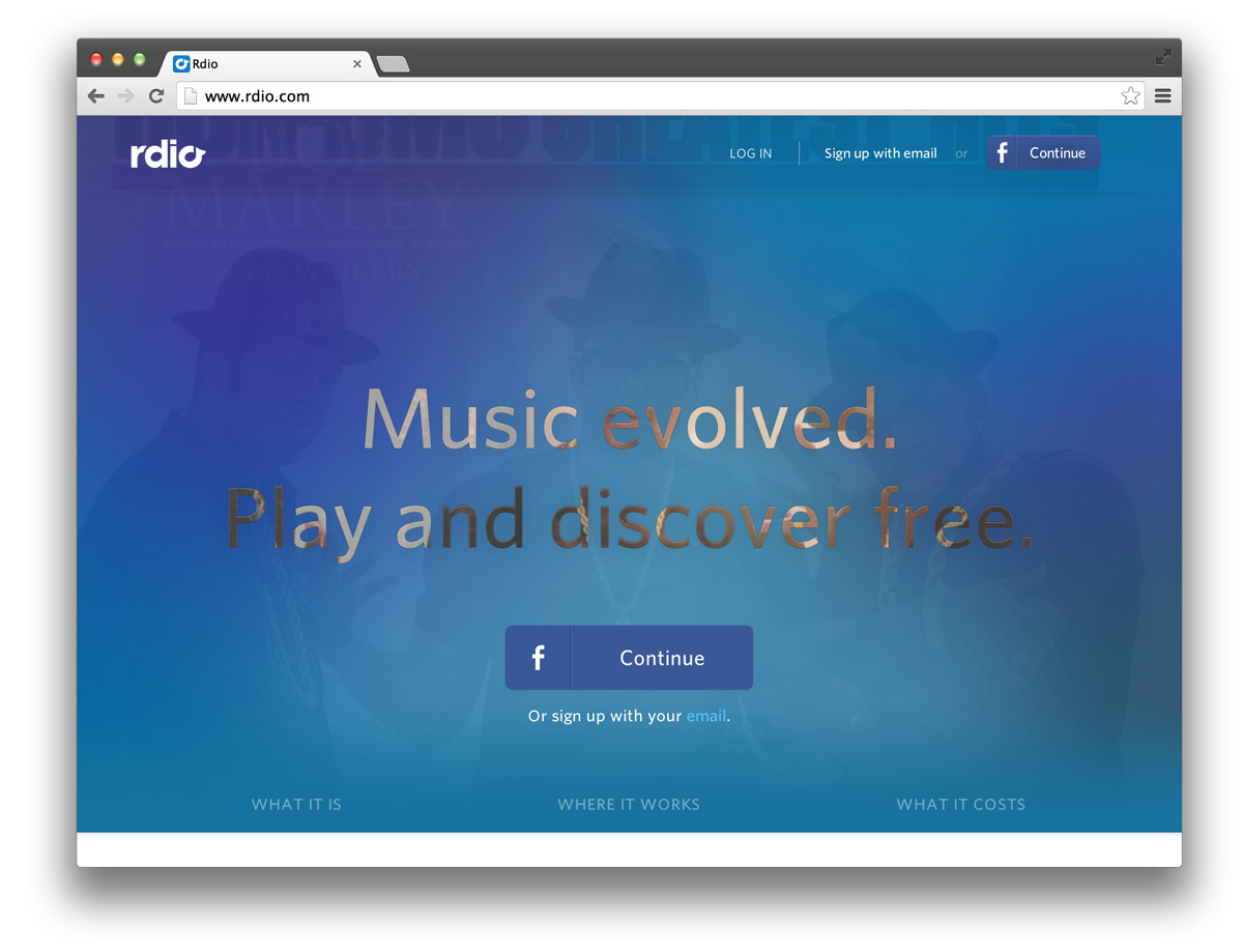
Above the Nav

The splash page of the future?
This emerging design trend can be characterized by text overlaid on huge faded imagery or massive blocks of a site’s latest and greatest content, all of which appears before the site’s main navigation.
I’m calling this recent design trend above the nav.
Examples in the wild:
- rdio
- Polygon
- Always Creative
- Globule Bleu
- Mooncamp App
- NBA All Stats
- Martina Sperl
- Snipcart
- Mahedine Yahia
- Medium posts (Ex: Why are you designing single screens?)
- Pretty much any startup website
What do you think of this trend? Good? Bad? With great splash page design comes great user experience responsibility? Chime in below!
Above the Nav » http://t.co/IgdOcJ43a5
— Chris Valleskey (@cvalleskey) January 24, 2014